Neutral is a palette, not a personality
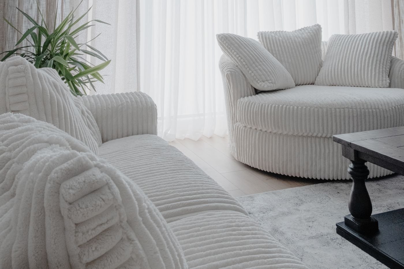
A neutral room can feel rich or strangely empty even when the furniture list is almost identical. The difference often lies in the surfaces. A sofa covered in a flat, smooth fabric beside an equally smooth rug and a plain laminate table offers little variation for the eye to explore. Add another beige cushion and the problem may remain. Texture gives a restrained palette depth, but only when the differences are large enough to register. Think about soft against hard, open weave against close weave, and reflective against matte before thinking about another shade of cream.
Start by looking at the room without its small decorative objects. What gives the large surfaces character? The answer might be wood grain, a visibly woven sofa, a rug with a modest pile, or a wall finish that holds gentle shadows. If the main elements are all visually flat, tiny textured accessories will struggle to change the overall impression. Choose where texture should be most noticeable. A room benefits from a few substantial material decisions more than from a collection of small objects whose only purpose is to make the palette seem less empty.
Build a family of undertones
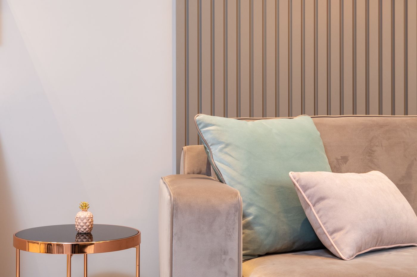
Neutral colors still have direction. A gray can lean blue, a white can feel yellow, and a brown can carry red or green. They do not all need to share the same undertone, but their relationships should feel intentional. Place the main fabric, wood, and paint samples together in daylight. If one suddenly looks pink or dirty beside the others, try changing that pairing before assuming the whole palette is wrong. A darker element can sometimes make the relationship clearer by giving pale surfaces something definite to stand against.
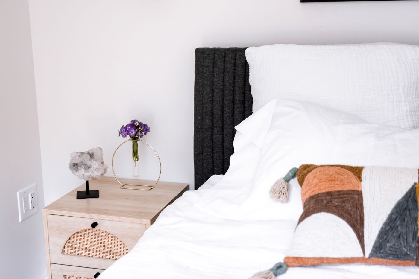
Choose a range of lightness rather than a series of almost identical pale tones. A warm white wall, a mid toned timber table, and a charcoal detail can establish a readable structure while still feeling restrained. Without that range, furniture edges may blur together and the room can seem unfinished. Contrast does not have to mean black. A deep olive, dark tobacco brown, or muted blue gray can provide definition. Select a color that relates to the room's existing materials, then use it in a few places where it helps a shape become legible.
Let the largest textile do real work
The sofa, curtains, and rug occupy enough area to establish the tactile character of a room. Choose at least one of them with a texture you can appreciate from a normal viewing distance. A finely marled upholstery can look richer than a completely flat cloth without introducing a strong pattern. A curtain with gentle irregularity can soften a long wall. A rug may supply the most obvious texture underfoot, but its maintenance and construction still need to suit the household. Texture is useful when it supports the way the room is used, not when it requires constant protection.
Ask for samples large enough to judge. Small swatches can exaggerate a weave because they are examined closely, while a whole sofa is usually seen from several steps away. Place the sample on the furniture if possible and step back. Consider how light falls across it at different times of day. A textured fabric can show pronounced shadows under side lighting and look almost flat in diffuse light. This changing appearance is part of its appeal. Make sure you like both states rather than choosing the cloth only for the most flattering photograph.
Wood can provide warmth and structure
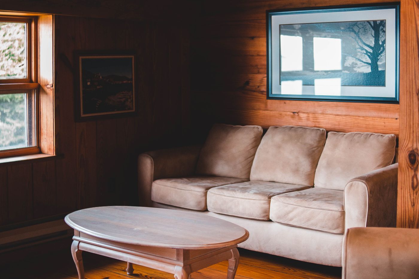
Wood is particularly useful in a neutral scheme because it offers both a color and an internal pattern. A clear grain can make a simple table feel substantial without adding decorative shapes. Pay attention to the finish, not only the species name. A glossy coating, a pale matte finish, and a deeply stained surface can give similar timber very different roles. If the room already contains a wood floor, compare the new piece in place. The aim is a relationship of warmth and depth rather than a perfect match that may be impossible to achieve.
Avoid scattering many tiny wooden accessories around the room in an effort to add warmth. One well proportioned table or cabinet may contribute more than several bowls and ornaments. Large pieces also establish a visual anchor. If everything sits on delicate legs and every material is pale, the room can feel weightless. A solid cabinet or darker chair frame can provide the needed balance. The right amount depends on the architecture and furniture layout. Look at the overall distribution of visual weight, especially from the doorway, rather than evaluating each object separately.
Mix smooth and rough thoughtfully
A tactile room needs smoothness as well as texture. A polished ceramic bowl can be more appealing on a coarse woven runner than beside several equally glossy objects. A smooth painted cabinet can give a textured rug room to stand out. If every surface is rough, fringed, or heavily woven, the room may begin to feel restless despite its quiet colors. Decide which material is the strongest tactile feature and let adjacent objects be simpler. Contrast makes each quality easier to appreciate; constant emphasis can flatten the distinction between them.
Touch matters, but not every texture belongs where hands or bare skin meet it. A coarse cushion that looks attractive but is uncomfortable to lean on is an awkward choice for the main sofa. An irregular table surface may not suit glasses or writing. Reserve demanding textures for places where their practical limitations do not cause daily irritation. Test the actual use: sit against the upholstery, place a cup on the table, and feel the edge of a throw. A room should offer sensory interest without making ordinary activities inconvenient.
Use light to reveal the materials
Texture is partly a conversation with light. Side lighting can reveal folds, weave, and shallow relief that overhead light barely notices. Place a lamp where it illuminates a material you want to enjoy rather than simply filling an empty corner. A curtain beside a shaded lamp, for example, may gain depth from a soft gradient of light. Keep glare out of normal sightlines and use appropriate fixtures according to their instructions. The objective is comfortable illumination that allows the surfaces to show their character, not a theatrical effect that makes the room harder to use.
Look at how the palette behaves after dark. Several warm materials under very warm lamps can become more orange than expected. Cooler neutral fabrics may appear flatter. There is no need to chase an identical daytime and nighttime appearance, but the room should remain coherent in both. Try the proposed lamps and fabrics together before multiplying a lighting choice throughout the room. If fixed wiring or new electrical work is required, have it planned and carried out by a qualified professional. A decorative lighting idea does not remove the need for a safe, suitable installation.
Leave space between the details
Texture needs room around it to be readable. A woven basket partly hidden behind a stack of magazines and several small ornaments may contribute clutter rather than depth. Clear a few surfaces and examine what remains. A table with one substantial object can show both the table's material and the object's shape. This does not require a sparse home. It means allowing everyday collections to gather in clear areas instead of spreading every item evenly across the room. Grouping creates quieter intervals, which make the textured elements feel more deliberate.
Storage can support that balance. A cabinet with doors may absorb the bright, irregular packaging that would otherwise compete with a restrained palette. Open shelves can hold books and personal objects, but they need not display everything the household owns. Edit by use and by the strength of the object, not by whether every item matches the color scheme. A meaningful brightly colored book can be welcome in a neutral room. Removing every trace of ordinary life often produces a more artificial result than allowing a few honest exceptions.
Finish with a room you can maintain
Before adding the final layer, review the cleaning and care requirements of the materials already chosen. A delicate looped textile, an absorbent unfinished surface, and a pale rug may each be manageable alone but demanding together. Balance them with practical choices where wear is greatest. Keep care instructions and use only methods suitable for the specific products. A neutral palette shows some forms of wear clearly, so it helps to understand which changes you will accept as character and which will make the room frustrating to live in.
The final test is simple: remove one accessory and ask whether the room becomes calmer or merely emptier. If it becomes calmer, leave it out. If it feels empty, consider whether a larger material decision is missing rather than immediately replacing the small object. A tactile neutral room is built from relationships between substantial surfaces, with decoration providing a lighter finishing note. When the weave, grain, light, and silhouettes already carry the room, the palette can remain restrained without feeling anonymous. The result has enough depth to be interesting and enough ease to be used every day.
Live with the largest changes before buying the smallest ones. A new rug or curtain can alter how much detail the room needs, especially once it has settled into familiar light and daily use. Give the arrangement time to become ordinary. The most convincing finishing choices often become obvious only after the room is functioning, when you can distinguish a useful addition from a purchase made to fill a photograph.
Take it home
- Vary texture at the scale of furniture, not only accessories.
- Keep some smooth surfaces to balance rougher ones.
- Check the entire palette in evening lighting before committing.