Decide what warm should feel like in your room
Warm white is a broad description rather than a precise color. It can suggest a faintly creamy wall, a pale stone shade or a white with a restrained pink or yellow influence. Those differences matter when the color covers an entire room. Begin by describing the result you want without using a product name. Perhaps you want a white that softens dark timber without looking cream, or one that sits comfortably beside a warm stone floor. A clear description helps you reject colors that are attractive in isolation but wrong for the relationship the room needs.
No white remains visually identical under every kind of light. The aim is to find one whose changes you enjoy in the conditions that matter, not to eliminate change altogether. A room used mainly in the evening should be judged under its normal lamps as well as in daylight. A bright kitchen may need a different balance from a quiet bedroom, even when both are intended to feel warm. Treat warmth as a quality of the whole room: the walls, floor, furnishings and lighting contribute together. Paint cannot reliably compensate for every conflicting element on its own.
Start with the finishes that are staying
Collect samples or clear views of the materials that are difficult to change: flooring, worktops, tile, cabinetry and any dominant upholstery. Put them beside the paint candidates rather than evaluating the white against a blank desk. A creamy floor can make a cleaner white look sharp; a pink-beige stone may reveal an unexpected greenish cast in a neighboring sample. These relationships do not mean either material is defective. They show that whites are judged through comparison. The useful choice is the one that allows the fixed materials to look intentional together.
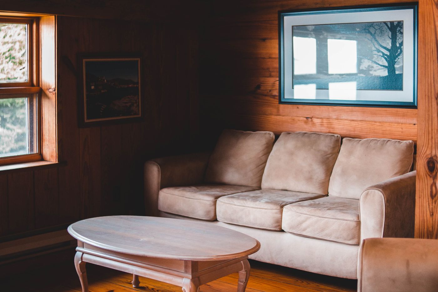
Imagine a room with honey-toned oak flooring and a pale sofa. A very yellow white may repeat the floor's warmth so strongly that the room feels more golden than intended. A quieter warm white could provide enough separation while retaining a soft atmosphere. In another room, a muted pink-white might relate well to a rosy stone surface but feel disconnected beside gray tile. These are possibilities to test, not universal pairings. Keep the actual materials visible throughout the decision, especially when visiting a paint shop where the lighting and surrounding colors differ from your home.
Reduce the shortlist before painting samples
A wall covered in dozens of white swatches can make the decision harder. Start with a small shortlist that represents meaningful differences: one softer cream, one more neutral warm white and perhaps one slightly deeper pale shade. Compare the cards together to understand their relative character, then test only the strongest candidates properly. Read the manufacturer's color descriptions as context, but do not treat words such as chalk, ivory or linen as standardized definitions. Different brands use familiar names for very different colors, and screens cannot provide a dependable physical match.
Keep a brief note of why each candidate remains. One might relate to the floor, another might work better with the existing trim, and a third may have the depth you want for the evening. If two samples are almost indistinguishable in the relevant conditions, you may not need to keep both in the process. Avoid introducing a new candidate every time you browse an attractive room online. A photograph includes its own light, camera processing and surrounding palette. It can suggest a direction, but it cannot establish how a named white will behave on your walls.
Make samples large enough to have a presence
Use the paint maker's recommended sampling method and allow the sample to dry as directed before judging it. A large movable sample board can help you compare positions without surrounding each candidate with a different existing wall color. If the board, primer or sample finish differs from the final paint system, remember that the result is a guide rather than a perfect replica. Follow product instructions for preparation and application. Do not disturb an uncertain old coating or substrate simply to create a sample; seek suitable professional advice when the surface or its history is unknown.
Place the sample vertically, as the wall will be seen, and move it beside the relevant materials. View it near the window, on a darker wall and beside the trim. Keep enough distance to see it as part of the room rather than studying only its edge. Label the back clearly and record the finish used. A small unlabeled patch can become confusing after several days, especially when two colors are close. The purpose of sampling is to make the choice more concrete. Give each candidate a fair, consistent test rather than relying on memory.
Observe the light you will actually live with
Look at the samples at the times the room is used, including an ordinary overcast day if possible. Notice direct sun, reflected color from outside and the shadow on walls away from the window. Window orientation gives useful context, but neighboring buildings, trees and glazing can change the result substantially. Avoid treating a direction label as a complete lighting description, particularly across different hemispheres. What matters is the light that reaches this room. A candidate that feels pleasantly warm near the window may become dull in the deepest corner, or unexpectedly creamy when the sun falls across it.
At night, use the lamps and overhead lights you normally switch on. If you intend to change them, make that decision before finalizing the paint. A wall color chosen under temporary lighting may disappoint when the permanent lamps arrive. Consider brightness and glare as well as the apparent warmth of the light. If one lamp makes every sample look unpleasant, investigate the lighting rather than repeatedly rejecting paint. Use compatible products and appropriate professional help for fixed electrical changes. The paint choice should be assessed within a settled lighting plan, even if that plan is modest.
Choose the relationship with trim and ceiling
Warm walls can look warmer when placed beside a much cleaner trim white. That contrast may be exactly what you want, but it can also make the walls appear creamier than the sample suggested. Test the combination rather than choosing the trim automatically. Using related whites can create a softer boundary, while a clearer contrast emphasizes doors, skirting and window frames. There is no obligation to make every architectural detail stand out. In a room with modest proportions or many interruptions, a quieter relationship can help the surfaces read as a whole.
The ceiling is another neighboring surface, not a separate abstract white. Consider how its color appears above the walls, especially in a room with little daylight or a pronounced ceiling shape. A single color used in appropriate finishes can simplify the palette, although sheen and the direction of light may still make the surfaces appear different. Ask the manufacturer about suitable products for each substrate and use. Do not assume a wall paint is appropriate for all joinery or ceilings. Decide the visual relationship first, then specify the compatible paint system that can achieve it responsibly.
Understand what sheen adds to the color
The same named color can feel different in a flat, eggshell or more reflective finish. Reflections change how a surface is read, and they can reveal preparation marks or make an otherwise quiet wall more active. Choose the finish for the room's use and the product's stated performance rather than assuming the flattest option is always best. A frequently handled area may need a different balance of appearance and cleanability from a low-contact bedroom wall. Read the actual technical and care information; finish names are not perfectly consistent between manufacturers.
If sheen is important to the decision, obtain a sample or view the intended finish rather than relying entirely on a different sample product. Consider how raking light from a window will cross the surface and how the wall is likely to be cleaned. Touch-ups can remain visible depending on the finish, condition and application, so keep the product details and follow the maker's advice for future maintenance. A warm white that works beautifully in color but poorly in daily care is not the complete answer. The right specification joins the visual choice to the room's practical demands.
Commit to the best fit rather than an impossible constant
Review the shortlist with the main furniture and fixed materials visible. Choose the candidate that remains agreeable through the important conditions, even if it changes slightly between them. A white that is perfect for ten minutes of sun and wrong for every evening is a weaker fit than one that feels consistently comfortable. If none works, revisit the brief: you may prefer a deeper pale color rather than a white, or the room may need a lighting adjustment. Do not force the category simply because warm white sounded like the safest starting point.
Before the full job, confirm preparation, primers, coverage, drying conditions and suitability with the product instructions or an appropriate decorator. Keep records of the exact color, finish and batch information supplied. Once the room is complete, return furniture and textiles before judging the final effect. Empty painted rooms can feel different from inhabited ones. Allow yourself to stop comparing. The successful white will not announce the hours spent choosing it; it will let the floor, furniture and changing light belong together. Its warmth comes from that relationship, rather than from a promise printed beside the color name.
Take it home
- Test beside the fixed flooring, stone and upholstery.
- Use a small shortlist with meaningful differences.
- Review samples in daylight and normal evening lighting.
- Confirm the intended finish and compatible preparation system.