Define the landscape you are borrowing from
Earthy is a generous word. It can describe pale sand and chalk, red clay, dark soil, olive leaves or the deep brown of weathered timber. A room that tries to include all of those directions can become less coherent than expected. Start with a narrower idea: perhaps warm clay with muted green, or pale stone with tobacco and a little charcoal. The aim is not to reproduce a literal outdoor scene. It is to choose a family of colors whose relationships you understand well enough to carry through paint, upholstery and smaller objects.
Find a reference with several useful tones, such as a piece of pottery, a textile or an artwork you already value. Look for a light, a middle depth and a dark, rather than collecting only similar muted shades. An earthy palette can contain crisp boundaries and substantial contrast; it does not have to be uniformly soft or beige. Write a brief description of the intended feeling and the colors that support it. That description will help you decide whether a tempting new object belongs in the room or is simply another attractive brown, green or pink that leads the palette elsewhere.
Let fixed materials set the starting temperature
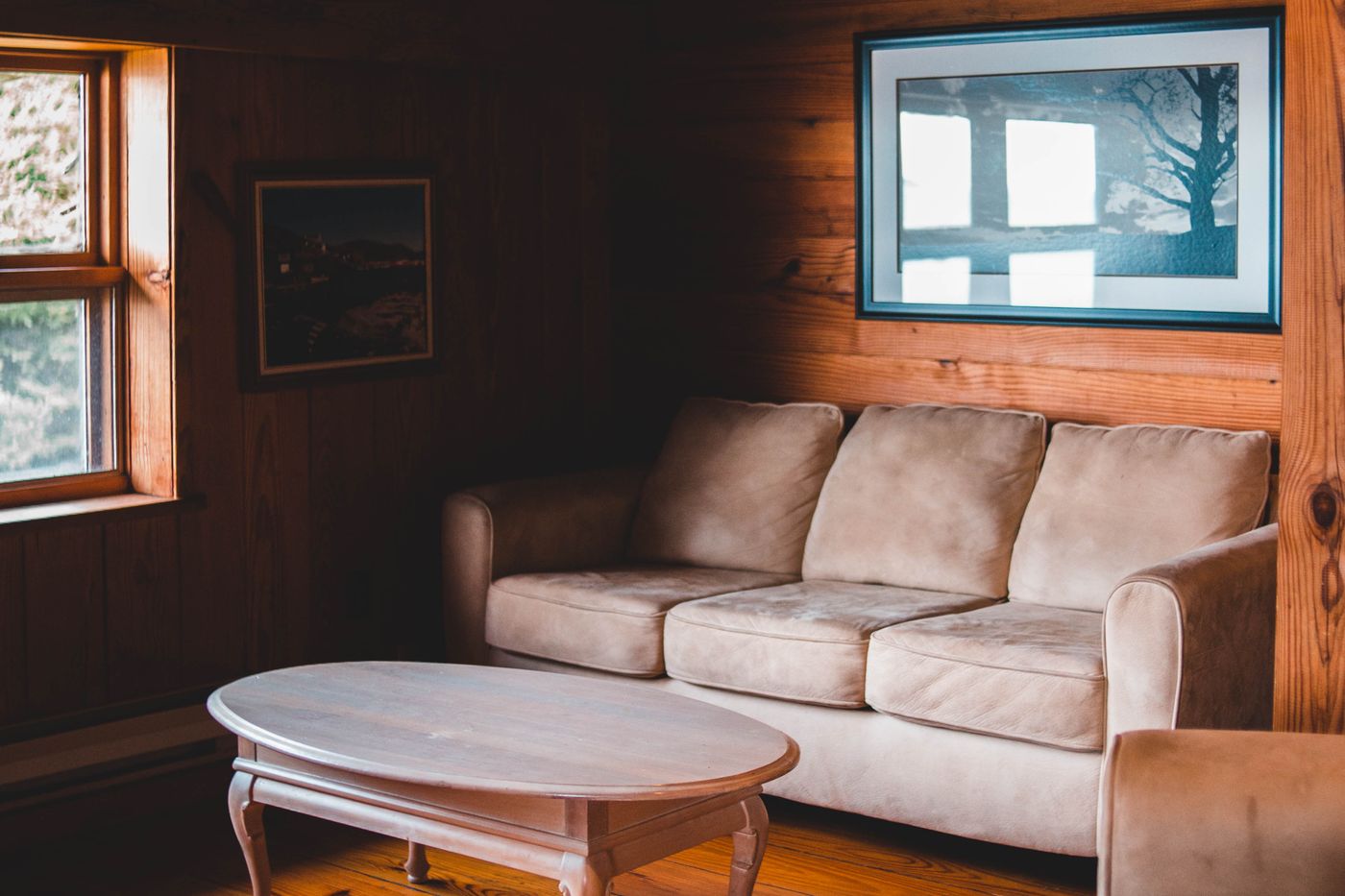
Floors, stone, cabinetry and large existing furniture already contribute color. A honey-toned floor will participate in an earthy room whether or not it appears on the mood board. A cool gray tile may need a different relationship from a warm pink stone. Put real samples beside each other before choosing the wall paint or sofa. Color names such as mushroom, clay and olive are too broad to establish compatibility on their own. One mushroom may lean pink, another gray, and the distinction can become obvious only when a large surface is installed.
Keep the palette responsive rather than corrective. If the floor is strongly warm, you do not necessarily need to cool every other surface to compensate. You might choose a quieter warm wall and add depth through a dark table, or introduce a muted green that gives the timber a contrasting neighbor. If a stone surface contains several visible colors, select one or two to develop rather than trying to repeat every vein. The room needs a clear relationship, not a complete transcription of the material. Let difficult-to-change elements become part of the plan instead of treating them as inconveniences to conceal.
Establish a value range before choosing accents
A common difficulty with earthy schemes is that every selected color sits in the middle of the light-to-dark range. The wall, sofa, rug and curtains may each be attractive, yet together they blur. Before adding an accent color, check whether the room has a sufficiently clear pale area and a sufficiently deep one. A lighter curtain can separate a sofa from the wall, while a dark chair frame can give a soft seating group an outline. The contrast may be modest in area and still make the larger muted surfaces easier to read.
Imagine a living room with clay walls, a tan sofa and a brown rug. Adding another mid-brown cushion is unlikely to clarify the composition. A pale woven cushion, a deeper brown table or a clearer light rug may be more useful, depending on what the room needs. Test the changes with samples and actual objects rather than assuming darker is always better. A phone image converted to grayscale can be a rough aid for noticing similar depths, but it cannot replace seeing the real materials. Texture, sheen and light all affect how the contrast is experienced in person.
Give the main colors different jobs
Assign colors by role rather than distributing them evenly. A pale stone wall can provide the broad background, an olive sofa can become the main colored mass and tobacco leather can appear in one chair. A dark timber table may supply the deepest outline, while smaller clay-colored objects connect the warm notes. This hierarchy lets each color be noticed without asking every surface to compete. You do not need to calculate exact proportions. Look at the room from its usual entrance and notice which element reads first, which supports it and which merely adds a small point of interest.
The dominant color does not have to be the wall. In a room with light walls, a large rust-colored rug might lead the palette. In a dining room, a dark wood table and cabinetry may carry most of the visual weight. Let the layout and the pieces you intend to keep inform the hierarchy. If several substantial surfaces all demand attention, simplify one before adding more accessories. A clear role also helps future purchases: you can ask whether the new textile supports the background, reinforces the main color or introduces a genuinely useful accent, rather than buying it because it is vaguely earthy.
Use material contrast to keep muted colors alive
Earthy colors can feel rich when their materials differ. A smooth glazed ceramic beside dry linen, a polished timber edge against a flat woven rug, or a small metal detail within a matte palette gives the eye a change in behavior. The colors can remain related while the surfaces catch light differently. Avoid choosing every object in a similarly rough, distressed or heavily textured finish simply because the palette is grounded in natural references. That repetition can make the room feel themed and visually dense. A quieter smooth surface often makes the more tactile material more noticeable.
Consider how the finishes will be used. A glossy tabletop may add brightness but also show reflections and marks differently from a matte one. A coarse cushion may look inviting while feeling uncomfortable against skin. A beautiful open-weave rug may not suit the room's traffic or care routine. The material choice needs to work physically as well as visually. Start with one or two strong textural contrasts and let the rest remain simpler. You can add depth through the actual objects the household uses, rather than through a growing collection of decorative pieces selected only to demonstrate different textures.
Choose a small amount of a clearer note
A muted palette sometimes benefits from one color that is slightly clearer or more decisive. That might be a deep green book spine, a blue ceramic bowl or a rust stripe with more definition than the surrounding textiles. The note does not need to be bright in a conventional sense. Its usefulness comes from the relationship to the quieter field around it. Choose it from an existing artwork or object where possible, then repeat it sparingly if the room needs a connection. A single meaningful piece can be enough; an accent is not a requirement to create a matching set.
If the room begins to feel busy, check the number of separate accent directions. Clay, olive and tobacco may already form a complete conversation. Adding blue, mustard, pink and black in equal small doses can turn that conversation into a collection of unrelated statements. Keep the accent that gives the room the clearest character and remove the rest temporarily. Alternatively, deepen an existing color rather than introducing a new one. A dark olive cushion can create definition within a green-led room while preserving its coherence. The right accent makes the main palette more legible, rather than advertising itself as the final decorating step.
Test the palette through the room's changing light
Muted colors are sensitive to their neighbors and lighting. A pale clay can look pinker beside green, while a brown fabric may become more orange under the lamps used at night. Test paint and textile samples together in the room, using the actual evening lighting as well as daylight. Keep samples large enough to have a presence and place them in the orientation of the final surface. A horizontal rug sample and a vertical curtain sample will catch light differently. Do not finalize a subtle palette from a screen image in which all the materials have been photographed under unrelated conditions.
If every candidate appears too yellow or too dull at night, investigate the lighting as part of the problem. Settle any intended changes before approving the final colors, using compatible products and qualified help for fixed electrical work. Consider the room's use, too: a dining area can tolerate a different depth from a work corner that needs comfortable task visibility. An open-plan space may require the palette to remain connected across several lighting conditions. Use a repeated material or a consistent background to provide continuity, while allowing the individual zones enough contrast to remain useful and distinct.
Edit the room at full scale
A palette board can hold more colors than a room needs because every sample occupies a small, controlled area. Once the main surfaces are in place, reassess before adding accessories. Look for places where similar middle tones merge, where a dark object feels isolated and where several warm colors become too dominant together. Try moving an existing object or clearing a surface before buying another. The room may need a pale pause or a stronger outline, rather than another variation of the same muted color. Make one adjustment at a time so its effect remains clear.
Then use the room. Earthy color is most convincing when it belongs to comfortable furniture, useful textiles and objects with a reason to be there. Let books, dishes and personal art bring their own small variations instead of forcing everything into an exact palette. The broad relationships can remain steady while ordinary life adds detail. Stop when the room has a clear range of depth, a few tactile differences and enough contrast for its shapes to be read comfortably. A grounded palette should feel generous and inhabitable, with the richness of related materials, rather than like a room carefully filtered into one continuous shade.
Take it home
- Start with fixed flooring, stone and cabinetry.
- Include a clear pale area and a deliberate dark note.
- Give colors different roles instead of equal coverage.
- Test paint, textiles and lighting together before committing.